Dimensionality Reduction “behind the scenes”: how do the most popular algorithms work?
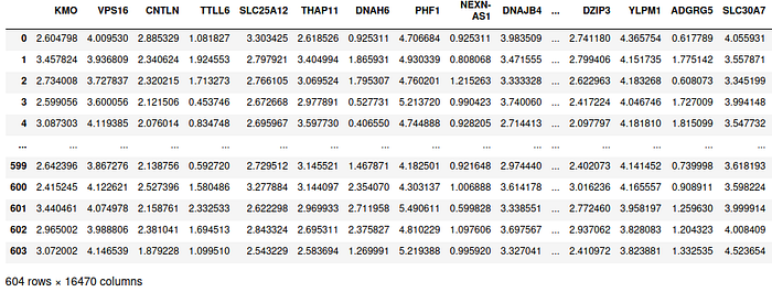
Let’s start from a sample dataset, containing gene expression on healthy lung tissues for 604 patients.

In this example, each row represents the gene expression for each patient, and each column represent the expression of each gene across patients. As we can see in the description at the bottom of the table, we have p=16470 attributes or features for each of the n=604 patients. Note that in this example there are many more features than patients, a common scenario in genomics as well as in other scientific fields.
Whenever we are interested in a more compact representation of the dataset (i.e. a dataset with less features), we apply a suitable dimensionality reduction technique.
Dimensionality reduction refers to the process of reducing the number of features in a dataset.
More formally, given a dataset

where each of the n samples is a d-dimensional vector, we want to obtain embeddings (i.e. low dimensional representations)

where k < n. Note that in general a smaller value of k leads to larger information loss. Dimensionality reduction is useful when this information loss is compensated by one or more of the following advantages:
- More convenient data visualization. By reducing the dimensionality of our dataset to one, two, or three components, we can very easily visualize the dataset in a plot. The following example shows a 2D representation of a gene expression dataset obtained via PCA (one of the techniques we will discuss in this post).

- The dataset becomes more suitable for downstream machine learning tasks. If the number of features is higher than the number of samples, we are in a so-called high-dimensional setting. High dimensionality imposes a variety of problems, including multicollinearity, lack of identifiability, impossibility to fit models able to capture the underlying complexity of the problem (aka curse of dimensionality), and difficulties to estimate statistical quantities of interest (such as p-values). While different solutions exist (high-dimensional statistics is per se a course taught at graduate level in many universities), applying a proper dimensionality reduction technique can remove this challenges in the first place. For this reason, dimensionality reduction is a common pre-processing step in a variety of machine learning tasks.
- Dimensionality reduction can be used to save storage space. Even if we will not discuss autoencoders in greater details in this post, they are a huge success story in deep learning and definitely deserve a mention. The goal of autoencoders is learning the best latent representation of an input, such that its reconstruction loss is minimized. Let’s take, for instance, an image: given its pixel representation, autoencoders learn both how to map the image to a low dimensional representation and how to map this low dimensional representation back to an high dimensional representation which is very similar to the original image. This can be used to save a lot of storage space for images: instead of storing a huge collection of high dimensional images, one can store their low dimensional representation and the parameters to map them back to the original image.
Now that we know why dimensionality reduction is relevant, we should ask ourselves another fundamental question “out of the infinite possible mappings from a high dimensional space to a low dimensional embedding, which one should we prefer?” After all, if we wanted, we could simply pick two random numbers for each sample in our 100-dimensional dataset and we reduce the dimensionality of the data. But, of course, this is would not be a good idea…
While there is no perfect answer to what mapping we want to choose (this also depends on the particular task we are tackling), two important criteria are:
- The low-dimensional representation should allow to compress the original data. In particular, from the low-dimensional representation, we should be able to accurately reconstruct the original high-dimensional representation.
- Interpretability. In some applications, for instance in the biomedical field, an insightful representation is highly valuable. Hence it makes sense to trade-off a bit of reconstruction error for a more informative representation.
We have introduced dimensionality reduction, what we want to achieve, and why. We are finally ready to dive into some of the most popular algorithms. In particular, we summarize PCA, ICA, t-SNE, and UMAP. Have fun in the journey!
Principal Component Analysis (PCA)
PCA is a linear dimensionality reduction technique that project the n points of dmensionality d in a “good” hyperplane of dimensionality k. Recall that given our goal of compressing the data, we have k<d. The case k≥d is uninteresting because it would be trivial to achieve zero loss and the advantages discussed above would not hold.
There are two main questions:
- Given a “good” hyperplane of dimensionality k, how do we map each original vector into this subspace?
- What is a “good” hyperplane of dimensionality k?
Let’s start with question 1. Given a “good” hyperplane W (which can be represented as a matrix of dimension d x k, where each column is one of the k components), PCA solves the following minimization problem:

In the formulation above, X is our dataset (of dimension d x n, each column representing a sample) and z is the k-dimensional representation of each sample. Note that the problem above can be solved independently for each sample: we can find one column of z at a time by considering the corresponding column of X. Note that in this case the optimization problem is equivalent to solve a linear regression, where W is the covariates matrix and each column of X is the independent variable. Since linear regression minimizes the Euclidean distance between the original sample and the solution, we have a neat interpretation for PCA: PCA orthogonally projects each original sample into the chosen low-dimensional hyperplane.
Now we only need to address question 2: “out of the plethora of possible low-dimensional hyperplanes, which one should we pick?” The answer picked by PCA jointly optimize both W and z in the equation above. In particular, the matrix W is constrained to be orthogonal. This has two nice consequences:
- PCA picks the k components that the greatest variance of the data comes to lie on the first coordinate (called the first principal component), the second greatest variance on the second coordinate, and so on. In particular, this means that PCA picks the k components that explain the most variance in the dataset X.
- PCA can be optimized via the Single Value Decomposition (or SVD, for short). Concretely, given a centered dataset with unit variance, the k principal components (i.e. the k columns of W) are given by the k eigenvectors of X associated with the largest eigenvalues.

Independent Component Analysis (ICA)
ICA is a popular technique from signal processing that can also applied to dimensionality reduction in the case that the dataset has more features than samples. It is useful to introduce this technique via a popular methaphor: cocktail party problem.

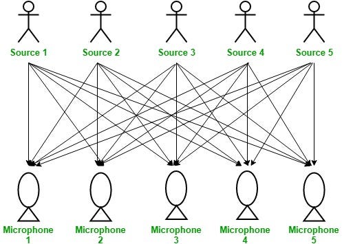
In a room there are n people and n microphones (the figure above shows the situation for n=5, note that the number of microphones and people is the same). Each microphone is placed in front of its respective speaker and records the sound in the room. Given the n microphone measurements, the goal is separating the sound to obtain the isolated recordings of each speaker.
ICA provides a solution for the cocktail party problem. First, we state the main ideas of this approach, and finally we discuss how this can be applied to dimensionality reduction. ICA has two main assumptions:
- The sources must be stochastically independent.
- The sources must be non-gaussian.
The second assumption is required because ICA relies on a property that can be derived from the central limit theorem: the sum of two non-gaussian variable is “more gaussian” than both the original variables.
Concretely, given the n mixed signal, ICA aims to find the coefficients of the linear combination such that the resulting variable is as less gaussian as possible. Why does this give a good solution? Note that each linear combination of the mixed signals can be expressed through a linear combination of the independent components (we can consider the independent components and observed signals as a different basis for the same space). The non-gaussianity of the linear combination is minimized when only one coefficient of the independent component is non-zero. This is the reason why ICA assumes non-gaussianity of the independent components: if they were gaussians, their sum would always be gaussian, regardless of the coefficients’ choice!
Once ICA has found the coefficients such that the linear combination of the mixed signals is as less gaussian as possible, this linear combination is assigned to be the first independent component. One can show that there are exactly n sets of coefficients as solutions, and each of them corresponds to a single component analysis. For more details, we refer the reader to this excellent blog post.
Now that we know how ICA recovers the original signals from the mixed ones, let’s go back to dimensionality reduction. Using the metaphor of the cocktail party, the features in the dataset are the people. If the dataset has more features than variables (i.e. in the high-dimensional setting), then having more features than the number of samples doesn’t change the vector space, and so some of them can be thrown away. ICA then recovers the independent components, and each original feature vector can be projected into these new components.
t-SNE
t-SNE is a very useful method to visualize high-dimensional datasets in a 2D or 3D plot. Specifically, the embeddings are designed to preserve “similarities” from the high-dimensional samples: similar samples are mapped to nearby points and dissimilar samples are mapped to distant points with high probability. For this reason, in many situations, t-SNE is a very good method to work together with clustering algorithms. Additionally, since t-SNE is non-linear, it is able to to separate data that cannot be separated by any straight line (see this post for a beautiful visualization).
But how does t-SNE works? The best way to explain it, is separating it into three macro-steps:
- Modelling the similarity between each pair of points in the high-dimensional space. By design, the similarity of a point to itself is defined to be zero. While this may seem counter-intuitive at first, it has a clear justification: the similarity between samples is a probability distribution, and assigning a strictly positive probability to the similarity of a point to itself would hence be problematic.
- Defining a probability distribution on the low-dimensional embedding. Given the low-dimensional representation of two data points, this second probability is directly proportional to their similarity in the embedding.
- Finding the low-dimensional representation that makes the resulting probability distribution in step 2 as similar as possible to the probability distribution computed in step 1. This ensures that the low-dimensional representations will preserve the same “structure” observed in the high-dimensional space: “close” points in the high-dimensional space will be “close” in the embedding, and “distant” points in the original space will be “distant” in the low-dimensional space.
Let’s now take a look at the details for each macro-step:
- First, for each pair of different points i and j, we compute

which can be interpreted as “the probability that sample i picks sample j as neighbor, under the assumption that neighbors are picked in proportion to their probability density under a Gaussian centered at point i”. Note that the function above is a softmax function, and hence can be interpreted as a probability.
At this point, the careful reader might have spotted a caveat: the formula above contains a term for the standard deviation of each point! This is particularly useful when data are clustered in the high-dimensional space: it is the standard deviation of the cluster of i, where the probability weight of each point in the cluster is fully customizable (e.g. a simple uniform distribution). Otherwise, one should come up with a case-specific heuristic for this hyperparameter. If you are interested in more details, lookup for “perplexity parameter” online, there is a bunch of useful resources available.
Finally, since we want the similarity between points to be symmetric, we set

2. Now that we have a probability distribution for each pair of point in the high-dimensional space, we need to come up with another one in the low-dimensional space. The most obvious choice would be to use a Gaussian again. While this choice is theoretically possible, t-SNE picks a Student t-distribution with one degree of freedom. The Student t-distribution is similar to a Gaussian, but it has a longer tail (i.e. points “far” away from the mean have higher probability than in a Gaussian distribution). This property has been shown to work-well in practice to mitigate the crowding problem, i.e. it keeps the low-dimensional representation a bit more “separated”. The formula looks as follows:

3. It’s a good time to take a step-back and realize what we have computed so far: a probability distribution for the similarity in the high-dimensional space; and another distribution for the similarity in the low-dimensional space. The goal now is picking low-dimensional representations such that these probability distributions are as close as possible. To solve this problem, we initialize the embeddings at random (according to some distribution), and we optimize the KL-divergence between p and q using gradient descent. Of course, alternative distance measures and/ or optimization algorithms can be explored.
UMAP
Whenever someone mentions t-SNE, it’s very likely that UMAP will pop up in the conversation. In fact, UMAP and t-SNE undergo very similar steps. As in t-SNE, also UMAP starts by modeling the distances between each pair of high-dimensional points and tries to map them to a low-dimensional embedding that preserves this similarities. The main differences between both algorithms are:
- t-SNE initializes the embedding randomly. In contrast, UMAP uses a deterministic technique called spectral embedding.
- t-SNE minimizes the distance between the high and low dimensional probabilities, therewith moving all low dimensional embeddings jointly. UMAP moves one point at a time, making it computationally more efficient for large datasets.
- UMAP has an hyperparameter that makes it more customizable. In fact, when modeling the similarity between high dimensional points, it uses a tuning parameter for the number of neighbors it considers. Increasing this parameter puts more focus in the global structure, while decreasing it makes the low dimensional embedding more accurate when it comes to clustering. This hyperparameter adds a layer of indirection, but it provides more flexibility to the user such that it can find the most appropriate representation for her dataset.
If you are interested in the mathematical details about UMAP, check this out!

Feature Selection
All methods we discussed until now take as input the existing features and combine them into a smaller number of new features that were not present in the initial dataset. If we take a step back, however, we could do the following observation: “instead of combining existing features into new ones, why don’t we just pick the most interesting features that are already in the dataset? “
This is a perfectly valid idea, and it’s known as feature selection in the Machine Learning literature A number of algorithms have been studied over the years, including LASSO, regression trees, and greedy techniques such as forward and backward selection.
Conclusion
We are at the end of this post! We have discussed the idea of dimensionality reduction, its relationship to clustering, and the mechanisms behind four of the most popular algorithms: PCA, ICA, t-SNE, and UMAP. While there are countless alternatives out there, this are fundamental in every Data Scientist’s toolkit and very useful to keep in mind.
